Thursday, August 30, 2012

Haris Epaminonda - VOL. VI

0 comments

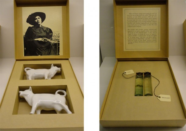
Haris Epaminonda VOL. VI 
2010
Installation view
VOL. VI was an installation made for Tate Modern's former Level 2 Gallery space in London by Cypriot artist Haris Epaminonda. This sixth part in an ongoing series of Volume works consisted of an array of framed appropriated images taken from anthropology publications - often, but not always, paired - alongside collections of found objects divided by temporary walls in an artfully laid out series of discrete rooms the final of which housed a video. 

The objects have the look and feel of a collection of exotic souvenirs gathered by a colonial explorer: statuettes, carvings, rugs, vessels, utilitarian or decorative. 

Adopting a spare and minimal approach that mimics museological conventions in order to unravel them, Epaminonda's installations bemuse and obfuscate where they should explain, and craft  narrative arcs through the creation of unexpected linkages. The deftly executed juxtapositions generate almost-tangible relationships through their exposure of similarity and difference in the found content. The origins of her objects remain hidden.


Monday, August 27, 2012

Cyprien Gaillard - Floods of the Old and New World

0 comments

Cyprien Gaillard - Floods of the Old and New World, 2011


This series of works by Paris born artist Cyprien Gaillard is a collection of postcards and snapshot photographs collaged together with labels taken from beer bottles. 'Floods of the Old and New World', combines a selection of Gaillard's personal photographs of a diverse range of urban locations,  with old postcards of 'exotic' or ancient cultures. 

Illustrating the fragmentary nature of anthropology, Gaillard's work addresses the touristic tokenism of yesteryear, and its implied connections with a fictional understanding of foreign cultures conbined with the effects of a globalized economy. Almost functioning like a seal, the beer labels show how implicit branding and consumption could be a way of linking notions of the old with the new.


Wednesday, August 22, 2012

Superflex - Guaraná Power

0 comments


Superflex Guaraná Power 2003
Cnsored version at the 27th Sao Paulo Biennial, 2006
Identity and design in collaboration with Rasmus Koch and Mikael Schustin


Superflex distribute their censored product
in the grounds outside the  2006 Sao Paulo Biennial
Superflex are a Danish collective whose work often sees them collaborating with designers, businesses and marketing agencies on projects which engage with issues around social, political and economic critique. Working across installation, film, commodity production and socially engaged/relational practices they seek to explore and expand upon art's potenital for affecting social change and thus challenge ideas about its boundaries and limitations. Superflex describe their works as 'tools'.


In 2003, they set up an ongoing project working with a guaraná farmers' cooperative from Maués in Brazil, producing a soft drink called Guaraná Power. The project was a response to the exploitation of Brazillian Guaraná farmers by multinational soft drink manufacturers operating in the area; despite an increase in profits the price paid for their produce was falling. Through setting up a self-organising company the collective helped farmers to resist the pressure to sell their products to large companies for next to nothing. Since then they have established an association called The Power Foundation, coordinating the company's activities and ensuring that farmers receive a decent and fair price for their guarana plus a profit share from sales of the soft drink.

Superflex have been involved in legal disputes around their use of commercial logos and trademarked material on a number of occasions, an interesting example occurred at the 27th Sao Paulo Biennial in 2006; The president of the biennial foundation, Manoel Francisco Píres da Costa censored the project, forbidding the curators from displaying the Guaraná Power soft drink as well as any references to the product. The group responded by self-censoring to an even higher degree than required, removing the name of the product and adding a black strikethrough on all text related to Superflex and their project from the bienniel's published material. 

Superflex's projects are not so easily read as straight forward anti-capitalist/anti-commercial/angi-globalist campaigns, more as excerices exposing and problematizing the economic relations that render current conditions possible.

Monday, August 20, 2012

Kate Owens - Affair at Styles (pink & blue)

0 comments


Kate Owens - Affair at Styles (pink & blue)
Soft drink, cotton t-shirt, 2008-11


A Tie-dye t-shirt emerging from a grape drink pushes together two distinct sub-cultural references of late 80's fashion and a Jamaican soft drink brand 'Bigga' popularised in London in the 90's. Negotiating the relationship between product and source, natural and artificial Owens work often asks us to reconsider the relationship between objects in the periphery of visual culture and the potential significance these objects may have in contemporary society. The combination of to the potential toxicity of the drink brand and the fashion of the 'peace-and-love' generation results in a seductive colour field with definate roots in painting. 
.


Thursday, August 16, 2012

Liam Gillick - Inside now, we walk into a room with Coca-Cola coloured walls

0 comments

Liam Gillick Inside now, we walk into a room with Coca-Cola coloured walls
1998


"Way outside the city, close to a National Park. A house without fencing to define the edges of its base. A building growing fresh from a grassy lump surrounded by conifers. Inside now we walked into a room with Coca-Cola coloured walls. The floor had been laid down some time ago. Planks of wood nailed discretely to a concealed series of solid chunked supports. The widest were certainly no less than that measure of a palm, the narrowest were at most only three fingers broad. The original putting down of this floor planking had been precise and complete. And now combined with walls the colour of Coca-Cola. Not the whole wall, but certainly the top three quarters of each, not including the area around the windows or the last small strip before the ceiling is reached. "

Liam Gillick, Discussion Island: Big Conference Centre, Chapter 1, 1997

Inside now, we walk into a room with Coca-Cola coloured walls charts British artist Liam Gillick's attempts to recreate a scene from one of his novels in which the first-person plural 'we' enter a room with Coca-Cola coloured walls. Gillick's writing and sculpture are often concerned with the peripheries, the back drops and the settings in which actions take place. 

This piece points us towards a consideration of the short-comings of visual perception, possibly hinting at a supremacy of written language in its ability to conjure imaginary worlds; There is an inherent humorous absurdity in the notion of creating Coca-Cola coloured paint - the beverage's reddish brown glow is largely due to its translucence. 

Tuesday, August 14, 2012

Ana Torfs - [...] STAIN [...]

0 comments
Ana Torfs - [...] STAIN [...]


Ana Torfs' work often exploits the gap between knowledge and perception. Working through systems of classification and the creation of taxonomies her work attempts to revisit the past and explore the multitude of ways in which it can be interpreted.

Commissioned for Manifesta 9 (2012, Genk) the installation [...] STAIN [...] by Torfs consists of 20 framed inkjet prints with feathers and coloured acrylic glass, 4 display tables, and two loudspeakers. The 20 vitrines display synthetic colours derivative from coal tar, the colours represent a vast industry built up from the manufacturing of synthetic dyes, which was only made possible through the commercial use of the waste products of coke manufacturing. 


"In 1856 the 18-year-old English chemistry student William Henry Perkin patented a purple dye, mauve, which he distilled from coal tar. Perkin discovered the dye by coincidence, when he was looking for a synthetic variant of quinine, in the fight against malaria. Mauve was the first mass-produced synthetic dye. The creation of mauve resulted in the emergence of big chemical companies. Bayer, BASF, as well as AGFA, all set out as dye manufacturers, during the second half of the 19th century. The research on synthetic dyes from coal tar induced many other discoveries and was crucial for the development of explosives, medicines and pesticides... 
In 1856 the 18-year-old English chemistry student William Henry Perkin patented a purple dye, mauve, which he distilled from coal tar. Perkin discovered the dye by coincidence, when he was looking for a synthetic variant of quinine, in the fight against malaria. Mauve was the first mass-produced synthetic dye. The creation of mauve resulted in the emergence of big chemical companies. Bayer, BASF, as well as AGFA, all set out as dye manufacturers, during the second half of the 19th century. The research on synthetic dyes from coal tar induced many other discoveries and was crucial for the development of explosives, medicines and pesticides."

Displayed in a pseudo-museological way, we are persuaded to consider each of the coloured panels from a historical context. The 20 selected dyes are titled with names such as 'Congo Red', 'Bismarck Brown',  and 'Paris Violet'; and are presented alongside connected images and a sample of feathers. Although creating specific connections between past histories and her work Torfs leaves many of the taxonomies empty leaving a scattering of clues which are impossible to describe the whole story, asking the viewer to compose their own subjective interpretation of the evidence.


Thursday, August 9, 2012

Susan Hiller - From The Freud Museum

0 comments

Susan Hiller - From The Freud Museum
1991 - 1996
From The Freud Museum is a vitrine containing 50 boxes each housing an artifact and accompanying image or text, collected by British artist Susan Hiller. The first version of the piece was produced in 1994 and exhibited at The Freud Museum in London, a later version completed in 1996 is now part of the Tate collection.

Evocative of a taxanomic display in an anthropological musuem the piece indicates an underlying logic to the display of the items which on close inspection is not to be found. Items are paired and placed intuitively, possible links between objects and texts, photographs, diagrams and notes are oblique; the viewer fills in gaps, finds similarities and diffrences and reflects upon possible reasons for their being together. The free association at play reminds us of the use of that tool with word games used to probe and pry into a patient's subconcious on a psycho-analyst's couch. 

Hiller said of the piece: "Sigmund Freud’s impressive collection of classical art and artefacts inspired me to formalise and focus my project. But if Freud’s collection is a kind of index to the version of Western civilisation’s heritage he was claiming, then my collection taken as a whole, is an archive of misunderstandings, crises, and ambivalences that complicate any such notion of heritage."

Monday, August 6, 2012

Mark Dion - The Schildbach Xylotheque 'Wood Library'

0 comments


Mark Dion - Schildbach Xylotheque 'Wood Library'


The Schildbach Xylotheque is a 'wood library' located in the Natural History Museum in Kassel, Germany. Collected by Carl Schildbach from 1771 to 1799 it is a unique collection of 530 'books' made from tree samples taken from 441 local tree's and arranged encyclopedically.

For dOCUMENTA (13) American artist Mark Dion was commissioned to design a permanent new display for the Xylotheque in the Museum. The Oak hexagonal chamber catalogues the collection placing each sample in a panel relating to its continent of origin. Dion has added six new 'books' to the collection made during a series of international residencies, the first was made from one of Beuys 7000 Oaks (presented and planted in 1982 for dOCUMENTA 7) symbolically completing the encyclopedic endeavor to represent each continent. Inserted into the reverse of the panels are five images made from wood representing Africa, Asia, Oceania, North and South America

Dion's work often explores scientific methods of taxonomies, and classification systems of museums of biology, archeology and biochemistry. Often skeptical of dominant subjective understandings of the world his work looks at the range of possible histories now on offer to contemporary society.


Thursday, August 2, 2012

Rob Matthews - Wikipedia

0 comments
 

Rob Matthews Wikipedia
2009

Rob Matthews Wikipedia is a 5000-page bound volume containing all of Wikipedia's featured articles. Inherently absurd, the book is obsolete as soon as it is produced; by the time the final article has been printed the first has almost certainly been edited.

The piece is intended to call into question the reliability of Wikipedia as resource, while also making a witty comparison between it and its printed precedents. Wikipedia is frequently cited as an example of the internet's unique ability to bring together the world's knowledge, though it's supposed impartiality and dependability have always been problematic.